A. Presidential Ad Campaign?(this is a year long project)
You will create an ad campaign for the presidential candidate of your choice. It can be an existing/current candidate or it can be a former candidate, Going as far back as George Washington.
Requirements:
Poster -
Who is you candidate, and Why should we vote for him/her?
Create a Slogan
Minimum of 7 words
11 x 17
CMYK
Add Bleeds
Use layers
Photoshop for imagery
InDesign for creation
Sketches required
Due date: 10/15
Magazine ad
Who is you candidate, and Why should we vote for him/her?
Write a 2 paragraph description about your candidate,
Be sure to use the same slogan you wrote for your poster
8.5 x 11"
CMYK
Add Bleeds
Use layers
Photoshop for imagery
InDesign for creation
Sketches required
Due date: 11/13
Website-2/13/16
Banner Ad-3/13/16
30 second Radio Ad-4/13/16
30 second TV commercial-5/13/16
Details to come
Deadlines / schedule to come
This is a year long project that is being completed simultaneously with your class projects. If you complete class projects early, you can work on your Ad Campaign. You can work with a partner to create your Radio Ad as well as your TV commercial.
This Project will include the following:
Writing Radio and TV ads
Creating story boards for your commercials
the use of Photoshop
the use of InDesign
the use of IMovie
the use of Dreamweaver
B. Photo a day: Photo Movie History
Requirements:
You will take a photo everyday in class at the same time of day of your computer screen. No selfies. At the end of the year we will make a movie of all the photos to be shown at the art show.
You can use your phone for this purpose only. No photos of me or you or your friends in class. The final project will be a work of Art to be proud of.
1. Found-Object ABC (or Number) Photography
HOMEWORK Photo images due 9.18.15 I will not accept letters from the internet. You must use your cameras or phones and take pictures of all 26 letters of the alphabet. I will approve the letters you have found prior to you beginning the collage
Final Collage due 9.28.15
Students use digital cameras to search out (scavenger-hunt style) the ABC's or numbers in found-objects - for instance, the support bars on the side of a swing-set could appear to be a letter 'A'. Students use Photoshop to enhance each photo, emphasizing the letter or number they are showcasing. Finished photos may be printed or turned into a digital collage.
Objectives:
1. The letters that are collected will teach you the difference of typefaces, and fonts
2. You will learn the differences and the naming of Fonts
3. Students will create a photo montage using the skills of Photoshop
4. Students will use layers in photoshop, and use Opacity layers, layer masks, and filters
Requirements:
11 x 8.5 document
RGB color
300 dpi
Use of multiple layers
All Final work must be saved as PDF and saved to your folder. Please print your documents and put your name and block number on the back of pages.
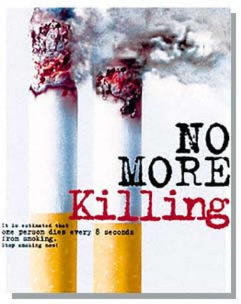
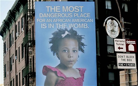
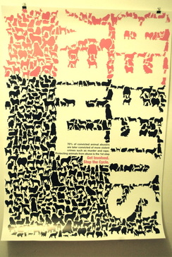
2. Social Issues Montage
Assignment date 9.14.15
Final Poster/Montage due 9.22.15
Students decide upon an issue they have a strong opinion on, or a viewpoint they want to express. Students must express this viewpoint using multiple layers of text, graphics, effects and blending tools to design a digital artwork in a propaganda-style. Students may search the internet, take photos, scan artwork or create original material for images.
Objectives:
1. Further exploration of Adobe photoshop and Adobe InDesign
2. Understanding the principals of color, design and composition
3. Creative use of Typography
4. Students will use layers in photoshop, and use Opacity layers, layer masks, and filters
Requirements:
Digital Photography for imagery. You are required to take photos for the images in your poster
11 x 17 document
CMYK color
300 dpi
Photoshop filters requirements
Final file to be saved as a Print ready PDF
3. Create an Infographic
Using Adobe Illustrator and Photoshop, you will create an 11 x 17 infographic.
Assignment date 9/30/15
Due 10/15/15
Requirements:
The majority of your time and effort will be focused on data and sketches. You are required to complete a very detailed sketch of your infographic before you start building this in Adobe Illustrator
See:
http://www.infobrandz.com/great-big-list-of-infographic-ideas/
Part of what makes infographics so popular -- and powerful -- is that they leverage two things that the web does especially well. On the one hand, infographics are incredibly visual, which is great because the web is an increasingly graphic-heavy visual medium. But infographics also play to -- and off of -- our love for big data. The web, after all, is swimming in data, and infographics are probably the best way to turn that data into a meaningful message or story.
But building a great infographic isn't as simple as data + picture. There's an art to creating great infographics, which is why I asked several industry leaders to share their best advice for creating great branded infographics.
Read more at http://www.imediaconnection.com/content/32894.asp#multiview#XVgHCXxRf5qY7ttv.99
1. Focused data:
Assignment date 9/30/15
Due 10/15/15
Requirements:
- Adobe Illustrator and Adobe Photoshop (Both are required)
- Final to be completed in Adobe Illustrator
- Detailed Sketches showing clear details and placement, including font usage
- 11" x 17" (Tabloid) Set as landscape, 17 x 11
- Layers-Use layers for each level of your illustration.
- Show Rulers
- Save as a PDF
The majority of your time and effort will be focused on data and sketches. You are required to complete a very detailed sketch of your infographic before you start building this in Adobe Illustrator
See:
http://www.infobrandz.com/great-big-list-of-infographic-ideas/
Part of what makes infographics so popular -- and powerful -- is that they leverage two things that the web does especially well. On the one hand, infographics are incredibly visual, which is great because the web is an increasingly graphic-heavy visual medium. But infographics also play to -- and off of -- our love for big data. The web, after all, is swimming in data, and infographics are probably the best way to turn that data into a meaningful message or story.
But building a great infographic isn't as simple as data + picture. There's an art to creating great infographics, which is why I asked several industry leaders to share their best advice for creating great branded infographics.
Read more at http://www.imediaconnection.com/content/32894.asp#multiview#XVgHCXxRf5qY7ttv.99
1. Focused data:
- Use relevant data
- Use reputable sources
- Fact-check - if the data you’re working with is untrustworthy, than your infographic will be too,”
- Only use data relevant to your infographic’s message – A great infographic allows the viewer to grasp the implications of big data. via @Stevology
- Credit your sources
- Limit your color palette
- Use simple graphics that that tie to your data
- Convey the message at a glance - take a lot of data, or a number of concepts, and boil it down to one image.
- Establish a connection between sections (good infographics utilize the hierarchy of information)
- Make sure the graphics and numbers match
- Answer an interesting question to grab audiences - A good infographic starts with a good ‘why’ question. via @ConversationAge
- Use rational data to elicit an emotional response (infographics attract almost 450% more “actions” than typical posts) (x)
- Graphics should tell the story – A great infographic tells a meaningful story in an instant.
- Use as little text (as possible) in a clear font - If your infographic is supplemented with 1,000 words, you’ve missed the mark.
|
|
|
|

|
|
I want to also encourage you to try some brainstorming sessions. Try techniques such as the following:
- Word storm – Choose a meaningful word in your niche, then list words that come to mind. Various categories are likely to surface.
- Mind mapping – Start with one central idea, then attach related ideas to it. Allow the peripheral ideas to spawn new ones.
- Visual association – Start with a visual and do the word-storm and mind-mapping exercises.
- What if – Challenge your thinking with “what if” questions to invoke different points of view around a problem or creative challenge.
- Ask questions – Write the questions you have about your topic and answer them quickly – without overthinking. Your answers are going to inspire new questions.
4. Create a Time in History
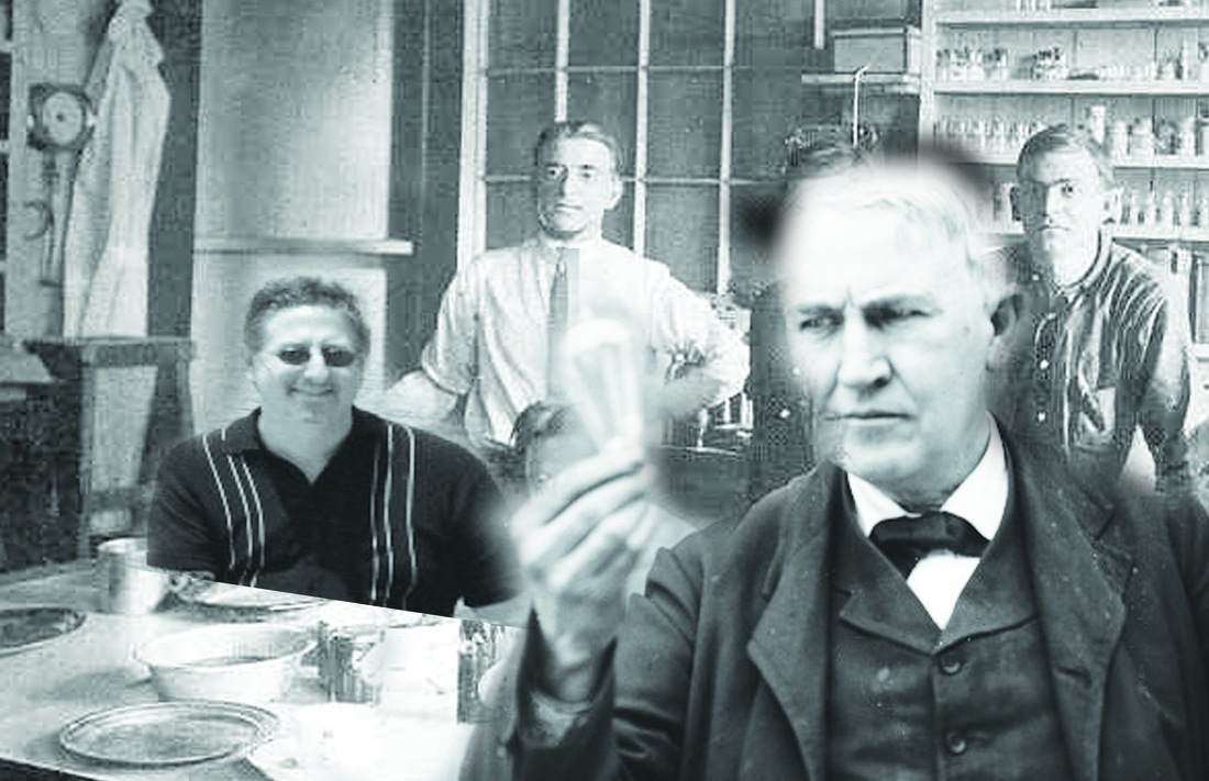
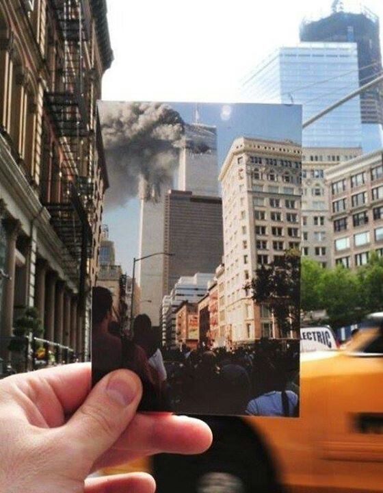
Using your knowledge of Photoshop you will accurately portray an important event in history. You will use layer masks and layers to recreate that special moment in History. You are there. You need to take a photo of yourself and place YOU in that time in history.
For Example:
The Battle of Waterloo. Napoleon is standing next to his canons. His soldiers are shooting their guns. Gun smoke fills the air. Soldiers are fighting with each other. The canons and smoke and soldiers have been added using layers in photoshop. You are sitting in a chair reading a book. In front of Napoleon.
For Example:
The invention of the light bulb. Thomas Edison is in his study holding his first lightbulb. The bulb is glowing. Other employees are watching in amazement. You are there. Possibly sitting there laying with sunglasses, catching the rays of light from the bulb. The tables and chairs and room have been created by you. Research that historical moment
Objectives:
1. Further exploration of Adobe photoshop
2. Understanding the principals of color, design and composition
3. Students will use layers in photoshop, and use Opacity layers, layer masks, and filters
Requirements:
You must create a detailed sketch in your sketch book before you begin. (color ideas, items ideas, etc)
photoshop document created without detailed preliminary sketches will not be accepted.
11 x 17 document
CMYK color
300 dpi
Photoshop filters requirements
Final file to be saved as a Print ready PDF
http://www.youtube.com/watch?v=JcRpcLy7kfw
For Example:
The Battle of Waterloo. Napoleon is standing next to his canons. His soldiers are shooting their guns. Gun smoke fills the air. Soldiers are fighting with each other. The canons and smoke and soldiers have been added using layers in photoshop. You are sitting in a chair reading a book. In front of Napoleon.
- You are wearing the clothes of the era....Photoshop
- The final image you have created has been pieced together using photoshop
- The colors of the final image must give the look and feel of the era.
- Look at old paintings from those moments in time, to help guide you in the style of the final image.
- The items you place in the final image must be accurate for the era
- The scene should be historically accurate. Not the composition
For Example:
The invention of the light bulb. Thomas Edison is in his study holding his first lightbulb. The bulb is glowing. Other employees are watching in amazement. You are there. Possibly sitting there laying with sunglasses, catching the rays of light from the bulb. The tables and chairs and room have been created by you. Research that historical moment
Objectives:
1. Further exploration of Adobe photoshop
2. Understanding the principals of color, design and composition
3. Students will use layers in photoshop, and use Opacity layers, layer masks, and filters
Requirements:
You must create a detailed sketch in your sketch book before you begin. (color ideas, items ideas, etc)
photoshop document created without detailed preliminary sketches will not be accepted.
11 x 17 document
CMYK color
300 dpi
Photoshop filters requirements
Final file to be saved as a Print ready PDF
http://www.youtube.com/watch?v=JcRpcLy7kfw
5. A Day in the Life
|
EXAMPLES OF STYLES
|
|
|

|
|
Using Adobe Illustrator, You will create multiple images using only the shape tools, paint brush tools and the pen tool. A complete scene will be created either from scratch or based on an existing image. The scene must fill an entire 8.5x11 page in Illustrator (including a background), and must tell a story.
Shape is an area that is contained within an implied line, or is seen and identified because of color or value changes.
Shapes have two dimensions, length and width, and can be geometric or free-form (organic).
Design in painting, is basically the planned arrangement of shapes in a work of art.
Themes:
Think about a moment in time that represents the theme below:
A DAY IN THE LIFE OF YOUR TEACHER
A DAY IN THE LIFE OF YOU
A DAY IN THE LIFE OF YOUR PARENTS
A DAY IN THE LIFE OF A BUS DRIVER
A DAY IN THE LIFE OF A WAITER
A DAY IN THE LIFE OF A COUNTER SERVER
A DAY IN THE LIFE OF A MOTORMAN ON A SUBWAY CAR
A DAY IN THE LIFE OF A SUBWAY WORKER
Requirements:
- You can trace an existing image, you find online. Using the layers palette, and the pen tool.
- You must use the shape tools. All shapes must be filled with color. Including the background
- You must create a very detailed sketch in advance of completing your illustration. I have colored pencils, if you want to show me color samples first
- Size is 8.5 x 11"
- Rulers must show in your file
- Final approved illustration must be save as a PDF in the PDF Folder
1. How to use the Paint brush tools
2. How to use the Gradient Panel
3. How to draw in Adobe Illustrator
4. Painting with Fills and Strokes

|

|
|

|
|
6. Redesign an Existing Movie Poster
You will re-design a movie poster of an existing movie.
Specs:
11 x 17
Use Photoshop and InDesign
CMYK
300dpi
______________________________________________________________________________________________________
Due 11/25/15
Sketches are 25% of your grade
Paragraphs are 25% of your grade
Final PDF is 50% of your grade
______________________________________________________________________________________________________
See Rubric for other details
A detailed sketch is required!
Show Font choice and Examples.
Trace images from your computer
A detailed sketch is required!
You must show fonts and example of the fonts you plan to use
You must trace images from your computer on to your sketch pad
You must keep track of all websites you visit and gather imagery.
Gather the information and research the movie from sources such as:
IMDB.com
RottenTomatoes.com
Fandango.com
moviefone.com
Watch the Trailers, Take Notes, Pay close attention to the hidden meanings of the trailers
You must write a 2 paragraph synopsis of the movie, and tell me why your poster design is successful. When you print out the poster you will tape the synopsis to the back of the poster
You are required to sketch your ideas BEFORE designing on the computer. Your sketches must be approved before you can build your movie poster.
RESEARCH IS ESSENTIAL!
|

|

|
|
|
|
Seven Elements of a Great Movie Poster Design
Big movies are a huge business, as the recent success of films such as Avatar and The Dark Knight suggests.
Billion-dollar revenue figures aren’t all that uncommon today in cinema, placing many major movies alongside companies such as Facebook when it comes to revenue.
With so much riding on a film’s success, marketing one is a massive opportunity for creative designers.
We’ve looked at some of the most effective film marketing materials out there – the promo posters that have been used on modern releases and older movies – and established some key elements that have contributed to their success.
These aren’t just commercial successes either – everything from smaller cult movies to huge blockbusters benefits from these 7 simple movie poster design elements.
1. Attention – jump out from the wall.I f there’s one simple sales formula that everyone in a performance-based position should know, it’s AIDA. The four-step formula – attention, interest, desire, and action – has been used as the basis of thousands of successful movie advertising campaigns.
The first step, and the one most important for designers, is attention – grabbing the attention of passers-by and encouraging them to look.
This doesn’t have to be achieved with provocative pictures or flashy graphics, although given their advantage at grabbing attention, it’s no wonder Hollywood’s turned to them en masse.
By using the film’s characters or a major plot point, designers can establish some level of plot while still gaining the attention of anyone that views the poster.
Check out The Hangover posters for a classic example. None are particularly beautiful, nor are they real iconic designs, but they’re very effective at getting people to look.
The flashy gradient background, head-and-shoulders character pictures (which can improve response rate,) and bright lighting make it difficult not to stare at one of these posters.
2. Iconography – showing without telling.The most effective movie posters are iconic, presenting the themes in the film without resorting to flat out saying what it’s about.
They use imagery, whether a close-up of a character or item that’s a major plot point, or a simple graphic, to establish the film’s plot. Combined with an eye-grabbing design, this can be an incredibly effective way to gain attention and create interest at once.
The Jennifer’s Body poster is a classic example of this, albeit one that borrows quite heavily from True Blood.
It uses tactics honed in on by advertisers over the decades – sex appeal, contrast, and spacing – to grab your attention.
At the same time, it also gives a glimpse into what the film is about. This allows it to market to casual observers and horror fans at once, all through imagery.
3. Interest – create an incentive to see the film.When using icons and more abstract imagery doesn’t work with your film – say, for example, it’s a serious drama or a thriller that can’t be explained with iconography – using an image that provides viewers with an idea of the story is a great idea.
Many of the best modern film posters use pictures that put the viewer in the middle of a scene from the film, creating tension and a major incentive.
The incentive is that in order to resolve the situation, the person looking at the poster needs to see the film and find out what happens.
The Inception poster uses this strategy – it puts viewers in the middle of a scene from the film that can only be explained by seeing what occurs before and after it. As a result, the curiosity created by the poster translates into on-the-spot ticket sales.
This type of design strategy tends to work best with films that cover unrealistic, fantasy-type events, particularly those that deal with the supernatural or psychological.
Since it’s hard to offer insight for this type of story using icons and simple colors, a still from the film can work wonders.
4. Appeal – create desire with fans and non-fans alike.With film studios cranking out comic book adaptations at a rapid pace, it’s the ‘true fans’ that end up last in the marketing line.
Studios can rely on them to see their new releases regardless of its review coverage or promotional materials, since chances are fairly strong they’re already aware of it. Great film posters, particularly those for adaptations, use this dual appeal to enhance their advertising.
Look at the Inglourious Basterds poster. It’s made by one of the world’s most celebrated and well-known film directors,yet it barely states his involvement on its promotional poster.
The reason is that Quentin Tarantino fans are probably already aware of the film itself – it’d spend several years in production before finally being released – while newer fans are less interested in its history.
Compare this type of promotional poster to the marketing materials used for films that draw appeal from the involvement of a certain actor.
Since fans’ ties with actors are generally weaker than those with directors or producers, their names usually appear in large print to grab attention. The stronger the audience’s bond, the less important it becomes to highlight features that appeal to current fans.
5. Style – a look that’s consistent with the film.Whether you’re marketing an art film or a blockbuster, style matters. Some of the most memorable film posters out there have used bold, unique artistic styles to their advantage.
What separates these posters from their ineffective art-for-art’s-sake rivals is that they’re consistent with style, in both the movie’s promotional materials and throughout the film itself.
The poster for Watchmen is a classic example of this technique succeeding. Since it uses an instantly recognizable comic book style, it grabs the attention of fans of the book.
It’s accurate too, using the same type of stylized imagery as the film itself. This consistency means that it isn’t just a great theater-based marketing tool, but a recognizable image for DVD and other releases.
6. Lasting Appeal – a look that suits other formats.Here’s the danger in getting too ‘arty’ and delicate with your film poster: it’s eventually, after release and theater shows, going to be shrunk to a fraction of its original size for the DVD release.
While a growing number of films now use different designs for their DVD cover than their in-theater promo posters, most of the classics and high-budget blockbusters still use the same poster for both.
This means that your imagery, your titles, and your major points of interest need to be just as visible on a small DVD case as they are on a giant movie poster.
The Jurassic Park poster really gets this feature, using imagery that’s just as visible and clear when it’s small as when its gargantuan. For your poster to work for the long-term, it needs to have scalable, clear, and lasting design appeal.
7. Recognizability – if it’s a sequel, make it obvious.From time to time, the entire box office seems to be made up of sequels.
There’s a good reason for it too – some of the most financially dependable films are sequels to successful franchises.
From films that dominated both the commercial world and the awards scene to purely commercial releases, few films can guarantee studios income like a good sequel.
That’s why sequel posters tend to be highly related to the first release, generally with a giant title in the top third of the canvas and instantly recognizable imagery throughout it.
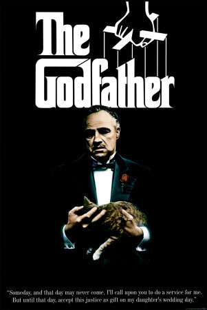
The Godfather and the two sequels in the franchise are a great example – all three use the same style and design, using the critical and commercial success of the previous films in the franchise to draw in would-be viewers.
Big movies are a huge business, as the recent success of films such as Avatar and The Dark Knight suggests.
Billion-dollar revenue figures aren’t all that uncommon today in cinema, placing many major movies alongside companies such as Facebook when it comes to revenue.
With so much riding on a film’s success, marketing one is a massive opportunity for creative designers.
We’ve looked at some of the most effective film marketing materials out there – the promo posters that have been used on modern releases and older movies – and established some key elements that have contributed to their success.
These aren’t just commercial successes either – everything from smaller cult movies to huge blockbusters benefits from these 7 simple movie poster design elements.
1. Attention – jump out from the wall.I f there’s one simple sales formula that everyone in a performance-based position should know, it’s AIDA. The four-step formula – attention, interest, desire, and action – has been used as the basis of thousands of successful movie advertising campaigns.
The first step, and the one most important for designers, is attention – grabbing the attention of passers-by and encouraging them to look.
This doesn’t have to be achieved with provocative pictures or flashy graphics, although given their advantage at grabbing attention, it’s no wonder Hollywood’s turned to them en masse.
By using the film’s characters or a major plot point, designers can establish some level of plot while still gaining the attention of anyone that views the poster.
Check out The Hangover posters for a classic example. None are particularly beautiful, nor are they real iconic designs, but they’re very effective at getting people to look.
The flashy gradient background, head-and-shoulders character pictures (which can improve response rate,) and bright lighting make it difficult not to stare at one of these posters.
2. Iconography – showing without telling.The most effective movie posters are iconic, presenting the themes in the film without resorting to flat out saying what it’s about.
They use imagery, whether a close-up of a character or item that’s a major plot point, or a simple graphic, to establish the film’s plot. Combined with an eye-grabbing design, this can be an incredibly effective way to gain attention and create interest at once.
The Jennifer’s Body poster is a classic example of this, albeit one that borrows quite heavily from True Blood.
It uses tactics honed in on by advertisers over the decades – sex appeal, contrast, and spacing – to grab your attention.
At the same time, it also gives a glimpse into what the film is about. This allows it to market to casual observers and horror fans at once, all through imagery.
3. Interest – create an incentive to see the film.When using icons and more abstract imagery doesn’t work with your film – say, for example, it’s a serious drama or a thriller that can’t be explained with iconography – using an image that provides viewers with an idea of the story is a great idea.
Many of the best modern film posters use pictures that put the viewer in the middle of a scene from the film, creating tension and a major incentive.
The incentive is that in order to resolve the situation, the person looking at the poster needs to see the film and find out what happens.
The Inception poster uses this strategy – it puts viewers in the middle of a scene from the film that can only be explained by seeing what occurs before and after it. As a result, the curiosity created by the poster translates into on-the-spot ticket sales.
This type of design strategy tends to work best with films that cover unrealistic, fantasy-type events, particularly those that deal with the supernatural or psychological.
Since it’s hard to offer insight for this type of story using icons and simple colors, a still from the film can work wonders.
4. Appeal – create desire with fans and non-fans alike.With film studios cranking out comic book adaptations at a rapid pace, it’s the ‘true fans’ that end up last in the marketing line.
Studios can rely on them to see their new releases regardless of its review coverage or promotional materials, since chances are fairly strong they’re already aware of it. Great film posters, particularly those for adaptations, use this dual appeal to enhance their advertising.
Look at the Inglourious Basterds poster. It’s made by one of the world’s most celebrated and well-known film directors,yet it barely states his involvement on its promotional poster.
The reason is that Quentin Tarantino fans are probably already aware of the film itself – it’d spend several years in production before finally being released – while newer fans are less interested in its history.
Compare this type of promotional poster to the marketing materials used for films that draw appeal from the involvement of a certain actor.
Since fans’ ties with actors are generally weaker than those with directors or producers, their names usually appear in large print to grab attention. The stronger the audience’s bond, the less important it becomes to highlight features that appeal to current fans.
5. Style – a look that’s consistent with the film.Whether you’re marketing an art film or a blockbuster, style matters. Some of the most memorable film posters out there have used bold, unique artistic styles to their advantage.
What separates these posters from their ineffective art-for-art’s-sake rivals is that they’re consistent with style, in both the movie’s promotional materials and throughout the film itself.
The poster for Watchmen is a classic example of this technique succeeding. Since it uses an instantly recognizable comic book style, it grabs the attention of fans of the book.
It’s accurate too, using the same type of stylized imagery as the film itself. This consistency means that it isn’t just a great theater-based marketing tool, but a recognizable image for DVD and other releases.
6. Lasting Appeal – a look that suits other formats.Here’s the danger in getting too ‘arty’ and delicate with your film poster: it’s eventually, after release and theater shows, going to be shrunk to a fraction of its original size for the DVD release.
While a growing number of films now use different designs for their DVD cover than their in-theater promo posters, most of the classics and high-budget blockbusters still use the same poster for both.
This means that your imagery, your titles, and your major points of interest need to be just as visible on a small DVD case as they are on a giant movie poster.
The Jurassic Park poster really gets this feature, using imagery that’s just as visible and clear when it’s small as when its gargantuan. For your poster to work for the long-term, it needs to have scalable, clear, and lasting design appeal.
7. Recognizability – if it’s a sequel, make it obvious.From time to time, the entire box office seems to be made up of sequels.
There’s a good reason for it too – some of the most financially dependable films are sequels to successful franchises.
From films that dominated both the commercial world and the awards scene to purely commercial releases, few films can guarantee studios income like a good sequel.
That’s why sequel posters tend to be highly related to the first release, generally with a giant title in the top third of the canvas and instantly recognizable imagery throughout it.
The Godfather and the two sequels in the franchise are a great example – all three use the same style and design, using the critical and commercial success of the previous films in the franchise to draw in would-be viewers.
|
|
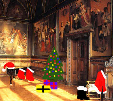
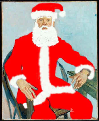
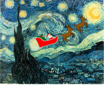
7. Holiday Card Parody
Using adobe illustrator and/or Adobe Photoshop and www.artcyclopedia.com, create ‘evidence’ that Santa has made his mark in a famous work of art. Create an illustration of hat/boots/coat and make it look like it belongs there in the work of art.
Print this in B & W first, then a color print. If you want extra credit, turn this into a greeting card using Microsoft Publisher – modify template to your needs.(Don't ask me how to use Microsoft Publisher, I do not know how to use it.)
Specs:
Print this in B & W first, then a color print. If you want extra credit, turn this into a greeting card using Microsoft Publisher – modify template to your needs.(Don't ask me how to use Microsoft Publisher, I do not know how to use it.)
Specs:
- Size 8.5 x 11"
- CMYK
- Resolution 300 dpi
- Use of layer masks
- Convert to a smart object 1st
- Rasterize image
- Be sure to find hi res images
7a. A teachers Christmas
Find a photo a photo of a teacher in school or take a picture of a teacher or staff member in school and place them in an unusual christmas scene, or famous painting.
- 1. Use effecfs in Photoshop you can change the look and style of a photo
- Size 8.5 x 11"
- CMYK
- Resolution 300 dpi
- Use of layer masks
- Convert to a smart object 1st
- Rasterize image
- Be sure to find hi res images
|
|
|
8.Design a 10 pg personal Yearbook
|
|

|
|
Using InDesign as the basis of your yearbook, you will create a 10 page InDesign Document. You will create your own personal story, that includes photos and /or illustrations and text about you, your social life, your family life and your school life. All photos will be editied in photoshop, and all illustrations if you choose to create illustrations will be edited or created in Illustrator. You will build your Yearbook using InDesign
Process:
1. Create a theme:
Examples
2. Using your phones or the internet. Gather photos to be used in the Yearbook.
3. Create a plan of your pages. Use InDesign as a tool to create your plan.
Examples
1. 10 page document in Illustrator
2. Photoshop to edit your photos
3. Adobe illustrator for creation of illustrations
4. You must use layers in all apps
5. You must show rulers in all apps
6. Written edited text for the name of your yearbook as well as descriptions of moments in time. You can also label those moments and write poetry or gather quotes that may represent a moment in time.
7. Sketches are necessary for the cover
8. Planning is essential So you need to make a list of what text goes on what page and what photos go on what page
9. Document 8.5 x 11"
10. All images are 300 dpi or higher
11. All images are CMYK
12.2 Final PDF are both print and interacvtiv
Process:
1. Create a theme:
Examples
- Childhood to Adulthood
- My sports life
- My Art life
- My school years
- My life at home. My friends etc
2. Using your phones or the internet. Gather photos to be used in the Yearbook.
3. Create a plan of your pages. Use InDesign as a tool to create your plan.
Examples
- Page 1 Cover
- Pages 2 and 3 Text spread(Ages 9-12) Photos of Age 9-12, Text about your 9th birthday, A favorite TV show etc.
- Pages 4 and 5 Text spread (Ages 13-14) Photos of Sporting awards. Text about how special that day was, A Famous quote
- Pages 6 and 7. . .
- Page 8....
- Page 9....
- Page 10....
1. 10 page document in Illustrator
2. Photoshop to edit your photos
3. Adobe illustrator for creation of illustrations
4. You must use layers in all apps
5. You must show rulers in all apps
6. Written edited text for the name of your yearbook as well as descriptions of moments in time. You can also label those moments and write poetry or gather quotes that may represent a moment in time.
7. Sketches are necessary for the cover
8. Planning is essential So you need to make a list of what text goes on what page and what photos go on what page
9. Document 8.5 x 11"
10. All images are 300 dpi or higher
11. All images are CMYK
12.2 Final PDF are both print and interacvtiv
|
|
|

|
8a. Understanding InDesign
INDESIGN BASICS
Practice 1
1. Understanding and Creating Text Frames
2. Understanding and Creating Photo/Image Frames
3. Using Text wraps
4. Send to back/ Bring to Front
5. Changing Opacity
Create a new document
Step 1. Create a Text frame and insert text
• Text (TYPE>Fill with Placeholder text)
• Change the Font and size, Set Bold or italic or both
Step 2. Create a photo frame and place a photo
• Resize photo to fill the photo frame
• Place the photo in Front of the text so that the photo overlaps the text (OBJECT>arrange>bring to front)
Step 3. Use Text wrap (WINDOW>text wrap)
• Photo to overlap text with 6pts space from photo to text
Step 4. Insert a background photo
• Insert a photo frame to bleed
• place photo in photo frame and adjust size to fill the photo frame
• Send photo to the back (OBJECT>arrange>send to back)
• Change opacity of the background image and so that type and images on top are readable
Practice 2a
1. Understanding and Creating Master pages
2. Understanding and Creating Paragraph styles
3. Understanding and Creating Character Styles
Create a new document
Step 1. Create 2 new master pages.
• Master page B contains and Object
• Master Page C contains text
Step 2. Create 4 Paragraph styles.
• Subhead level 1 (H1) (Bold Caps Centered, 24pts space above, 18pts space below)
• Subhead level 2 (H2) (Bold U/lc, Fl left, 24pts space above, 18pts space below)
• First paragraph of Text (TX1)
• Regular Text paragraph (TX)
Step 3. Create 2 Character style
• Bold First line of text
• All Caps Text in color, Bold Italic and underlined
Practice 1
1. Understanding and Creating Text Frames
2. Understanding and Creating Photo/Image Frames
3. Using Text wraps
4. Send to back/ Bring to Front
5. Changing Opacity
Create a new document
- 8 1/2" x 11"
- un-check Facing pages
- Check Primary text Frame
- .3 picas" margin
- .125" bleed
- All images Bleed
- All text text fits in margins
Step 1. Create a Text frame and insert text
• Text (TYPE>Fill with Placeholder text)
• Change the Font and size, Set Bold or italic or both
Step 2. Create a photo frame and place a photo
• Resize photo to fill the photo frame
• Place the photo in Front of the text so that the photo overlaps the text (OBJECT>arrange>bring to front)
Step 3. Use Text wrap (WINDOW>text wrap)
• Photo to overlap text with 6pts space from photo to text
Step 4. Insert a background photo
• Insert a photo frame to bleed
• place photo in photo frame and adjust size to fill the photo frame
• Send photo to the back (OBJECT>arrange>send to back)
• Change opacity of the background image and so that type and images on top are readable
Practice 2a
1. Understanding and Creating Master pages
2. Understanding and Creating Paragraph styles
3. Understanding and Creating Character Styles
Create a new document
- 6" x 9"
- Facing pages
- Primary Text Frame
- .50" margin
- .125" bleed
Step 1. Create 2 new master pages.
• Master page B contains and Object
• Master Page C contains text
Step 2. Create 4 Paragraph styles.
• Subhead level 1 (H1) (Bold Caps Centered, 24pts space above, 18pts space below)
• Subhead level 2 (H2) (Bold U/lc, Fl left, 24pts space above, 18pts space below)
• First paragraph of Text (TX1)
• Regular Text paragraph (TX)
Step 3. Create 2 Character style
• Bold First line of text
• All Caps Text in color, Bold Italic and underlined
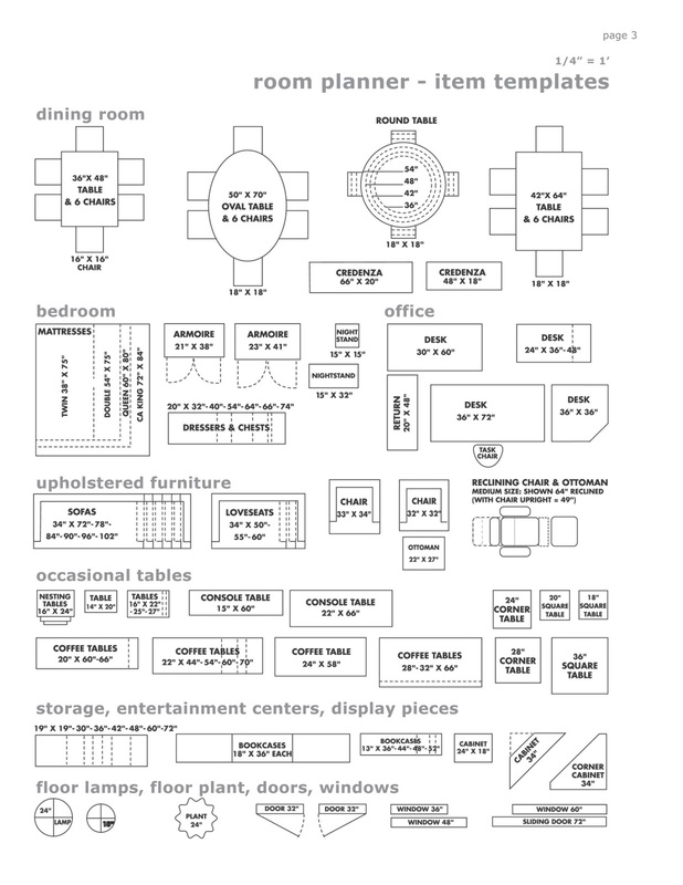
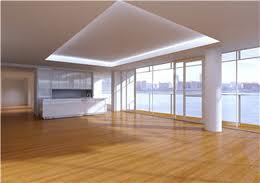
9. Dream Room Interior Design $10,000 Budget
|

|
|

|
You will design your personal apartment, or house. You are given a small budget of $10,000. You are the designer. You will draw a floor plan of the house or apartment in Adobe illustrator. And place model furniture in the room. Keep track of furniture and room sizes.
Using photoshop, you will decorate the room with furniture and rugs etc. You can go to the following websites to help build your place
http://www.homestyler.com/designer
https://www.3dream.net/jsp/public/content/product/free_room_planner.jsp
Instructional Plan
2. 2 night tables
3. A woman's Dresser
4. A Mans Dresser
5. 2 Comfortable Chairs
6. An Area Rug or Wall to Wall carpeting or a hardwood floor or a tile foor
7. A Fireplace or Wood Burning stove
8. Lamps
Objectives: You will:
Required:
Your choice: Adobe Illustrator and/or Adobe Photoshop or another online program of your choice.z
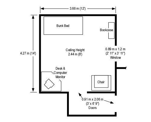
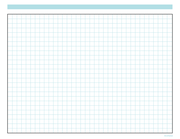
1. A grid or graph paper image of your apartments showing dimensions, and placement of windows and furniture
2. A 3-D version of 1 final room. Using these websites http://www.homestyler.com/designer
https://www.3dream.net/jsp/public/content/product/free_room_planner.jsp
3. A photoshop version of 1 complete room, based on images of items you have purchased wth $10,000.00
4. An Excel file, listing thet
Books:
Interior Design Course: Principles, Practices, and Techniques for the Aspiring Designer - A gallery of finished examples by professional designers and advanced students presents scores of beautiful and instructive color photos.
Becoming an Interior Designer: A Guide to Careers in Design - If you're embarking upon a career in interior design, here's a visual overview of the profession, with in-depth material on educational requirements, design specialties, finding a job, and the many directions a career in interior design can take.
Using photoshop, you will decorate the room with furniture and rugs etc. You can go to the following websites to help build your place
http://www.homestyler.com/designer
https://www.3dream.net/jsp/public/content/product/free_room_planner.jsp
Instructional Plan
- Find Furniture to furnish your bedroom. Remember, you have a $10,000 budget
- Keep track of your budget, Keep it in an Excel file. Do not exceed the budget, but come as close as possible to your budget.
- Required items for 1 final room
2. 2 night tables
3. A woman's Dresser
4. A Mans Dresser
5. 2 Comfortable Chairs
6. An Area Rug or Wall to Wall carpeting or a hardwood floor or a tile foor
7. A Fireplace or Wood Burning stove
8. Lamps
- 8.5 x 11"
- RGB
- 300dpi Resolution
- Architectural extras: Fireplace, Jacuzzi, gym area, balcony, exits to outside (type of doors), window seat, Loft.
- Floor coverings: Wood? Stone? Tile? What size tile? Carpet? Area rugs?
- Furniture: Bed, dressers, night tables, TV built-in? A unit for stereo/DVD, etc. Computer /desk area, lounge chairs, coffee table,
- Accessories: lamps, fan, decorative items on tables, wall décor, draperies, bedspread, accents.
- Wall Accessories: Wall paper. Paintings, Moulding.
Objectives: You will:
- Compare and contrast the different periods of interior décor from the 20th Century to the present.
- Pay attention to styles and make sure furniture and
Required:
Your choice: Adobe Illustrator and/or Adobe Photoshop or another online program of your choice.z
1. A grid or graph paper image of your apartments showing dimensions, and placement of windows and furniture
2. A 3-D version of 1 final room. Using these websites http://www.homestyler.com/designer
https://www.3dream.net/jsp/public/content/product/free_room_planner.jsp
3. A photoshop version of 1 complete room, based on images of items you have purchased wth $10,000.00
4. An Excel file, listing thet
Books:
Interior Design Course: Principles, Practices, and Techniques for the Aspiring Designer - A gallery of finished examples by professional designers and advanced students presents scores of beautiful and instructive color photos.
Becoming an Interior Designer: A Guide to Careers in Design - If you're embarking upon a career in interior design, here's a visual overview of the profession, with in-depth material on educational requirements, design specialties, finding a job, and the many directions a career in interior design can take.
|
|
|
|

|
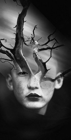
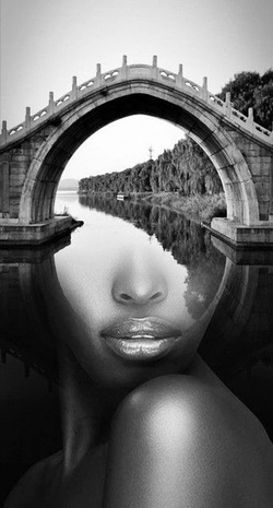
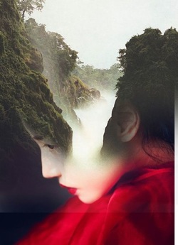
14.Surrealism: Combine multiple images to create a surrealistic face
Surrealism is a 20th-century avant-garde movement in art and literature that sought to release the creative potential of the unconscious mind, for example by the irrational juxtaposition of images..
PLAN
1. Find multiple of images
2. Combine the images to create an eerie and surrealistic image.
3. The final image is in graysclae
Document size:
11 x 17"
Resolution is 300 dpi
CMYK
PLAN
1. Find multiple of images
2. Combine the images to create an eerie and surrealistic image.
3. The final image is in graysclae
Document size:
11 x 17"
Resolution is 300 dpi
CMYK
|
|
|
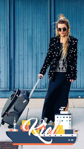
15. Create your Own Personal Geotag for Snapchat
Go to: https://www.snapchat.com/geofilters
Follow instructions on website for Photoshop sizes and dimensions
You must use your name, or nick name and an image that represents "YOU".
Follow instructions on website for Photoshop sizes and dimensions
You must use your name, or nick name and an image that represents "YOU".
|

|
|

|
|
|
16. Design or Illustrate a paragraph
In the right hands, a novel’s beginning alone can make you feel like you’ve just fallen into a fast-flowing river, snatched away from reality and hurtled downhill. They range from hard-boiled pulp fiction to classics to, well, The Bible; the only thing they have in common is that they’re so good it’s impossible not to read on. Unfortunately, right now you can’t. But you can share your minds eye view of that special moment in a graphic representation of that moment in time…
You have 3 classes to complete this project.
Steps and Requirements
1. Choose 1 of the the following paragraphs to create your graphic representation of that moment.
2. Choose the medium or mediums you would like to use to create this illustration. You can use multiple mediums to create your final image
• Photoshop and or illustrator
• Cut paper
• Charcoal and pastel
• Montage of images
• Crayons
• Markers
3. Include your paragraph in the illustration: Note in the examples below, the paragraph became part of the design. You must type your papragraph, Handwritten words are not acceptable
4. Size is 11" x 17" or 17" x 11"
5. 4 Detailed sketches showing placement and size of image are required. Sketches must be in your sketchbooks and not on loose paper. I will collect the sketch books during this quarter, so be prepared.
Choose from the following Books and opening Paragraphs
NORWEGIAN WOOD (HARUKI MURAKAMI)
I was 37 then, strapped in my seat as the huge 747 plunged through dense cloud cover on approach to Hamburg Airport. Cold November rains drenched the earth. lending everything the gloomy air of a Flemish landscape: the ground crew in waterproofs, a flag atop a squat building, a BMW billboard. So - Germany again.
THE HAUNTING OF HILL HOUSE (SHIRLEY JACKSON)
No live organism can continue for long to exist sanely under conditions of absolute reality; even larks and katydids are supposed, by some, to dream. Hill House, not sane, stood by itself against its hills, holding darkness within; it had stood so for eighty years and might stand for eighty more. Within, walls continued upright, bricks met neatly, floors were firm, and doors were sensibly shut; silence lay steadily against the wood and stone of Hill House, and whatever walked there, walked alone…
PRIDE & PREJUDICE (JANE AUSTEN)
It is a truth universally acknowledged, that a single man in possession of a good fortune must be in want of a wife. However little known the feelings or views of such a man may be on his first entering a neighbourhood, this truth is so well fixed in the minds of the surrounding families, that he is considered as the rightful property of some one or other of their daughters.
A TALE OF TWO CITIES (CHARLES DICKENS)
It was the best of times, it was the worst of times, it was the age of wisdom, it was the age of foolishness, it was the epoch of belief, it was the epoch of incredulity, it was the season of Light, it was the season of Darkness, it was the spring of hope, it was the winter of despair, we had everything before us, we had nothing before us, we were all going direct to Heaven, we were all going direct the other way — in short, the period was so far like the present period, that some of its noisiest authorities insisted on its being received, for good or for evil, in the superlative degree of comparison only.
A FAREWELL TO ARMS (ERNEST HEMINGWAY)
In the late summer of that year we lived in a house in a village that looked across the river and the plain to the mountains. In the bed of the river there were pebbles and boulders, dry and white in the sun, and the water was clear and swiftly moving and blue in the channels. Troops went by the house and down the road and the dust they raised powdered the leaves of the trees. The trunks of the trees too were dusty and the leaves fell early that year and we saw the troops marching along the road and the dust rising and leaves, stirred by the breeze, falling and the soldiers marching and afterward the road bare and white except for the leaves.
THE STRANGER (ALBERT CAMUS)
Mother died today. Or maybe yesterday, I don’t know. I had a telegram from the home: ‘Mother passed away. Funeral tomorrow. Yours sincerely.’ That doesn’t mean anything. It may have been yesterday.
Example:
Moby Dick bodily burst into view! For not by any calm and indolent spoutings; not by the peaceable gush of that mystic fountain in his head, did the White Whale now reveal his vicinity; but by the far more wondrous phenomenon of breaching. Rising with his utmost velocity from the furthest depths, the Sperm Whale thus booms his entire bulk into the pure element of air, and piling up a mountain of dazzling foam, shows his place to the distance of seven miles and more. In those moments, the torn, enraged waves he shakes off, seem his mane; in some cases, this breaching is his act of defiance.'
|
|
17. Yesterday and Today
|
Photography and Photoshop:
Using your phones or camera you will take a photo of an an existing location and superimpose the historical photo of that same location. You photo must include your hand holding the historical photo in the exact position for the photos to align You have 3 class to complete this project In photoshop you will adjust the lighting and add effects to marry the 2 images. Document information: 1. Photoshop 2. Photo is saved as CMYK 3. Resolution is 300 4. Size is 8.5 x 11 5. Save as final PDF |
|
|
|
|
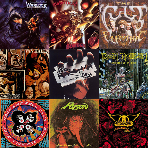
17. Record Company/CD Cover Design

|
|
|
|
You will create a record company and a band of your own, then use Photoshop to design their first CD cover. You should take into account the style of your band's music, as well as consumer expectations, and consider these ideas in the graphics. Research, research, research record company names, band names, and album names. Be sure the look of the CD is representative of the music the band plays. For example, If the band plays METAL, you wouldn't use a quiet beach scene on the cover.
Designs should include:
- the band's name
- album title
- record company title
- company logo
- listing of the tracks
- graphics
- CD design
- Front and back of CD case
CD sizing information Jewel Case Sizing information
|

|
18. Create a 1 minute GIF from your personal photos or drawings.
Let’s say you have a folder full of personal party images that you want to sequence together as frames in an animated GIF. You can find special programs online to do this, but with some of the features of Adobe Photoshop, it’s quite fast and simple. You can also take pictures using your phone, to sequence the images.
You can create your animation, such as a flip book. I will give you extra credit, if you create your own animation
Fade In & Fade Out an Animated .GIF in Photoshop
Set up your animation frames in the Timeline palette (known as the Animation palette in versions prior to CS6).
You can repeat this for each set of two adjacent frames that you want to fade in or fade out of each other. In the Tween dialog box, there are a number of other options which can be used to add effects such as position changes, which can be experimented with.
Requirements:
At least 20 images
Size is 5" x 5"
RGB
72 dpi.
Save all as flattened Jpegs before building your GIF in photoshop
Each will go on a separate layer
Retouch each photo as necessary, for consistency from slide to slide. For Example All background should be the same
All photos should have the same brightness and contrast.
You can create your animation, such as a flip book. I will give you extra credit, if you create your own animation
- Gather the images you want to animate into one folder. collect at least 20 images, or create 20 images, for an animated feature.
- Click File > Scripts > Load Files into Stack. When the “Load Layers” window pops up, click Browse to select & open your image files, and then click OK. This should import the files you selected as individual layers in your document. Rearrange the layers into the correct order, if necessary.
- Open the Animation palette (Window > Animation) if you have CS5. **Note! In Photoshop CS6, this is now known as the Timeline palette. So, go to (Window > Timeline) instead.**
- In the Animation/Timeline palette menu (found under this button at the top right corner of the palette: ), click Make Frames From Layers. You can also click Reverse Frames if needed. This will take each layer in your document and set it as an individual frame in the animation.
- Now we will change the duration of each frame. Make sure you are in frame view, not timeline view. If you do not see thumbnail icons of all your layers in the Animation/Timeline palette, click the icon in the lower right corner (the hover text will say “Convert to Frame Animation”). Now, back in the Animation/Timeline palette menu, click Select All Frames.
- Click the drop down button just underneath each frame image (circled in red in the image below). This will bring up a menu where you can set a duration. Since all frames are selected, all frames will be set to the same time. Each frame can be changed individually, if desired.
- The drop down button circled in black in the image above will change how many times the animation will loop; either a fixed number of times, or forever.
- Once the frame order and timing as been set up, it is time to save the image! Click File > Save for Web & Devices, make sure the file format is set to GIF, change any other options if needed, and save the image!
Fade In & Fade Out an Animated .GIF in Photoshop
Set up your animation frames in the Timeline palette (known as the Animation palette in versions prior to CS6).
- Select the animation frame that you want to start the fade effect.
In the Timeline palette menu (found under this button at the top right corner of the palette: ), clickTween… - In the box that pops up, make sure “Tween With: Next Frame” is chosen, so that the frame you selected will fade into the following frame. Under “Frames to Add” pick the number of new frames you want to add in between the current frame and the next frame. A larger number will make a smoother transition, but will result in a bigger file size. Make sure “All Layers” is chosen, and at least “Opacity” is checked. Click OK
New frames will be added in between the frame you selected and the following frame. The opacity of each layer is gradually transitioned from 100% to 0% and 0% to 100% respectively. This provides a good start, but one problem with this is that you can see the underlying transparency in the newly added frames, which will artificially brighten the image since there is no background layer. This is not what we want. Instead, we want the initial frame to have an opacity of 100% over the course of the tween, as the following frame gradually fades in. This can be manually edited for each frame in the Layer palette, but let’s avoid doing so: - In the Timeline palette menu, uncheck New Layers Visible in All Frames
- Click on your original initial frame to select it. Shift+Click the last of the newly added in between frames. This will select all of the in between frames, while still leaving the initial frame as the “main” selected frame, which is important for the next step.
- In the Layer palette, right click on the layer corresponding to the image in the initial frame (it should have 100% opacity). Click Duplicate Layer and then OK. This will copy your initial frame image to each of the in between frames at 100% opacity, which will make it appear that the next frame is fading in.
- Change the timing of each frame if needed, click File > Save for Web & Devices, make sure the file format is set to GIF, and save the image!
You can repeat this for each set of two adjacent frames that you want to fade in or fade out of each other. In the Tween dialog box, there are a number of other options which can be used to add effects such as position changes, which can be experimented with.
Requirements:
At least 20 images
Size is 5" x 5"
RGB
72 dpi.
Save all as flattened Jpegs before building your GIF in photoshop
Each will go on a separate layer
Retouch each photo as necessary, for consistency from slide to slide. For Example All background should be the same
All photos should have the same brightness and contrast.
19. The Power of Advertising
The Power of Advertising project uses technology in a matter-of-fact way to encourage you to explore how the underlying assumptions in the social, cultural, and political aspects of their lives. It combines "high tech" black-and-white digital photography (with an inexpensive digital camera, computer, and printer) with color created by hand with colored pencils or tempera paint. As artist Juan Chávez says, "I want students to utilize and play with technology, not worship it like a false idol."OBJECTIVES:
Investigate themes by creating multiple text/image versions based on one issue or idea. QUESTION TRUTH
THINK ABOUT
Name one thing a family member told you that you know was a lie. Can men do more than women can? Are women smarter than men are? Do you believe everything you see on television or in textbooks? Why not?
CHOOSE AN ISSUE
Name an issue or message YOU feel needs to be "PROMOTED" within their community (or possibly globally).
WRITE A SLOGAN
Create a slogan like "Just do it" or "Crack is Whack". It is best to have the saying be no more than 4 or 5 words. This is really the most difficult part of this project. Most students will simply write down a statement of the issue and be satisfied with it as the slogan. You will Reduce it to the least amount of words possible without losing its meaning. Rewrite it as necessary and exchange certain words with slang words you use everyday. Take your time on this. This is the intense portion of the project. Make your words meaningful.
Find PICTURES
This process of image creation could also be done using traditional photography, found images, copying machine, or stencils if you choose. Be creative.
|
|
|
20. Create a Digital Portfolio
Build an digital portfolio of the work you have created in the last 2 years. Your design work from your Junior year can be found in the archive folder. You can include personal drawings, illustrations, painting etc., in your portfolio. I will be reviewing this with a magnifying glass. I will be reviewing the following:
1. Use of Typography
2. Use of White space
3. Placement and use of images and words
4. CREATIVITY
5. Understanding margins
6. Creation of Links
7. Your design grid.
Requirements
YOU WILL USE INDESIGN TO CREATE YOUR ONLINE DIGITAL PORTFOLIO
1. All Work you have created must be saved as jpegs before you can import the pictures to your portfolio
2. Gather all your work that you have created and COPY to your new folder
3. Name your porfolio. This name will appear on the first page of the portfolio
4. Be sure to include an About page
5. Address/contact page
6. A homepage introducing yourself and your work
8. A portfolio page
9. You can insert art that you have created outside this class, including photography, that you would like to show
10. You can add work to the portfolio until the end of the year.
Set up
InDesign:
Size: 720 px x 600 px
single pages, no facing pages
Intent-For Web
.125" bleeds
Photoshop:
All Images are RGB jpegs, 72 dpi.
InDesign Demo
You will learn the following
1.The creation of new Document
2. The use of Tool Bars
3. Menus
4. The Creation of Master Pages
5. The Use of Text Frames
and Picture Frames
6. How to add color.
7. Understanding margins
You will save a copy of your practice work in the final folder.
Keep all your collected images in your job folder.
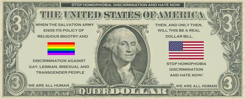
21. Create a $3.00 bill.
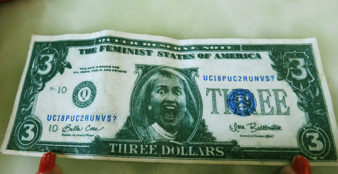
You will create the new $3.00 bill that will be released in 2015.
Using Photoshop, and InDesign and Illustrator, you will create the new bill. You will find images of people places or things and create the front and back of the new $3.00 bill.
1. Be sure the new bill represents your point of view about society.
2. Make a statement with the new bill.
3. Look a bills from other countries for ideas or for the overall look of the bill
4. Be funny or serious, its your choice
5. Do your research.
This is further exploration in the use of layer masks , filters, colors, typography.
Requirements:
1. Detailed sketches (with color, imagery and typography)
2. The study and use of typography
3. Collect samples for your ideas and save in your folders
4. Do not begin working in photoshop, indesign, etc. with my approval of your sketches.
5. Final bill will be printed out and front and back will be glued together
6. Size is determined by actual bill size.
7. Resolution is 300
8. CMYK
So whats the size of a a dollar bill? Anyone? 2.61 inches wide by 6.14 inches long, and the thickness is.0043 inches
WE WILL PRINT!
22. Incongruous Images
PART 1
"Make Incongruous Images" Assignment:
With Human Parts
Incongruity (in-con-GREW-i-tee) is
"a state of two or more things lacking harmony,
being incompatible,
inconsistent,
absurdly combined."
Such things are called "incongruous."
What makes anything funny or tragic is incongruity.
Incongruous images are often used in advertisements and in movies -- think special effects -- attention-getting and amusing.
Examples of incongruous images:
Your assignment is to find images that you can take parts from and put them together to form new images:
Special recognition
will be awarded for:
PART 2
The 2nd
"Make Incongruous Images" Assignment:
with No Human Parts
See the first "Make an Incongruous Image" assignment for a definition of "incongruous image."
This assignment:
Produce ONE image that combines two things -- neither being human parts nor human clothing.
As in the previous assignment, the goal is to find images that you can take parts from and put them together to form a new and "incongruous" image:
REQUIREMENTS
1. 2 documents 8.5" X 11"
2. CMYK
3. 300 dpi (resolution)
Special recognition
will be awarded for:
"Make Incongruous Images" Assignment:
With Human Parts
Incongruity (in-con-GREW-i-tee) is
"a state of two or more things lacking harmony,
being incompatible,
inconsistent,
absurdly combined."
Such things are called "incongruous."
What makes anything funny or tragic is incongruity.
Incongruous images are often used in advertisements and in movies -- think special effects -- attention-getting and amusing.
Examples of incongruous images:
- A guy you know puts on a mask that gives him the face of a monster, or of Adam Sandler, or of President Bush. (Not what you expect to see!)
- Helping to shop for groceries, you pick up a head of lettuce and notice that this head has facial features. (Startling!)
- The body of a movie character who nibbles on a magic doughnut gradually becomes that of an elephant. (Not the image a viewer expects to see!)
- A car going past you doesn't have wheels. It has the legs of an elephant instead. (Not what anyone would expect to see!)
Your assignment is to find images that you can take parts from and put them together to form new images:
- Find images on the Internet and save them as files in your folder on the student server, and / or find photos you scan and save in your folder.
- Use PhotoShop to create a new document - also called "photomontages" -- in which you combine incongruous portions of these found images.
- Alter the edges of every part you relocate so they look like they belong where you place them. If you put a new head on a body you must choose and position the head so that it looks like it could have grown from that body. Its size, color, texture, and placement must look compatible with the body. One might see the neck coming through the collar of the shirt on the body, for instance. That edge is most important, but the edges of the hair cannot display a reminder of the wallpaper that was once behind it when the body is in front of a snowy hillside.
Special recognition
will be awarded for:
- Most believable image.
- Funniest image
- Saddest or most tragic image.
- Strangest image.
PART 2
The 2nd
"Make Incongruous Images" Assignment:
with No Human Parts
See the first "Make an Incongruous Image" assignment for a definition of "incongruous image."
This assignment:
Produce ONE image that combines two things -- neither being human parts nor human clothing.
As in the previous assignment, the goal is to find images that you can take parts from and put them together to form a new and "incongruous" image:
- Find images on the Internet and save them as files in your folder on the student server, and / or find photos you scan and save in your folder.
- Use PhotoShop to create a new documents - also called "photomontages" -- in which you combine incongruous portions of these found images.
- Alter the edges of every part you relocate so they look like they belong where you place them. If you put a new head on a body you must choose and position the head so that it looks like it could have grown from that body. Its size, color, texture, and placement must look compatible with the body. One might see the neck coming through the collar of the shirt on the body, for instance. That edge is most important, but the edges of the hair cannot display a reminder of the wallpaper that was once behind it when the body is in front of a snowy hillside.
REQUIREMENTS
1. 2 documents 8.5" X 11"
2. CMYK
3. 300 dpi (resolution)
Special recognition
will be awarded for:
- Most believable image.
- Funniest image
- Saddest or most tragic image.
- Strangest image.
23.Goodbye Preston HS
Think about:
How will you be remembered?
How do you want the school to remember you?
What memories of your HS life, are key moments in your life
Using all the graphic design tools you have learned this, Adobe Photoshop, Adobe InDesign, Adobe Illustrator. And your final year at Preston High School, you will create a 11 x 17" self portrait poster.
Instructions:
1. Create Phrases about yourself
2. Find multiple images on the internet that represent you. Examples are:
4. Using Adobe Photoshop you will build an image collage. The collage should include drawings and photos
5. Using Adobe Illustrator you will create your type solutions, Curved type. Distorted type, Type in shapes etc., you can also create
6. Using Adobe InDesign, you will create an 11 x 17 single page document, you will build your poster in InDesign.
7. Print and put your name on the back of the poster
This will be a gift from our class to the school, I'd like to highlight these posters at the Student Art show at the end of April
How will you be remembered?
How do you want the school to remember you?
What memories of your HS life, are key moments in your life
Using all the graphic design tools you have learned this, Adobe Photoshop, Adobe InDesign, Adobe Illustrator. And your final year at Preston High School, you will create a 11 x 17" self portrait poster.
Instructions:
1. Create Phrases about yourself
- Sensitive to a fault
- I laughed to much
- You know I care
- Love is not real
- A friend once told me....
- You always came first
- I was always there for you
- I laughed all the time
- Music is my center
- Remember the time....
- Ill never forget....
- We were best of friends, I hope we stay in touch
2. Find multiple images on the internet that represent you. Examples are:
- A photo of a Sunny day
- A photo of Rain
- Photos of musicians
- Photos of happy moments
- Photos of saying Goodbye
- Photos that represent you.
- A guitar
- A camera
- Art supplies
- A globe
- Math symbols
- Historical photos
4. Using Adobe Photoshop you will build an image collage. The collage should include drawings and photos
5. Using Adobe Illustrator you will create your type solutions, Curved type. Distorted type, Type in shapes etc., you can also create
6. Using Adobe InDesign, you will create an 11 x 17 single page document, you will build your poster in InDesign.
7. Print and put your name on the back of the poster
This will be a gift from our class to the school, I'd like to highlight these posters at the Student Art show at the end of April
|
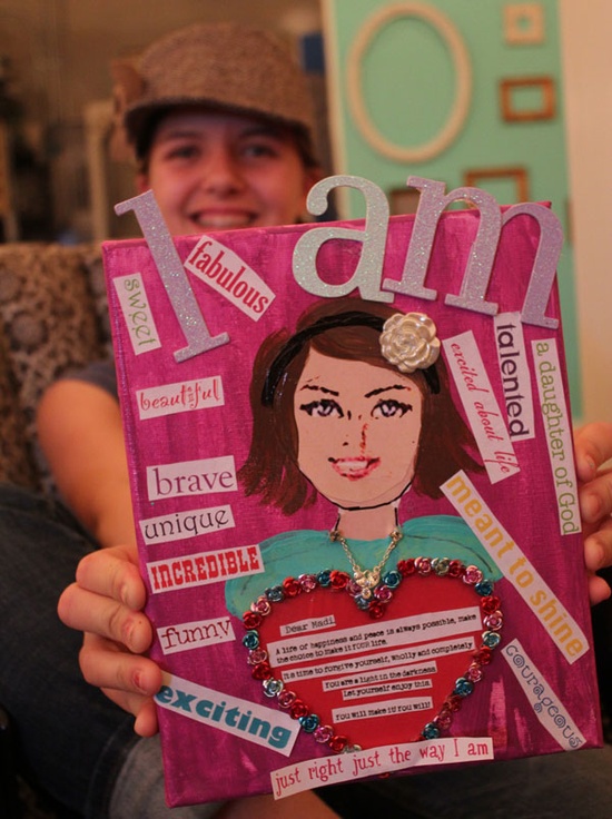
|
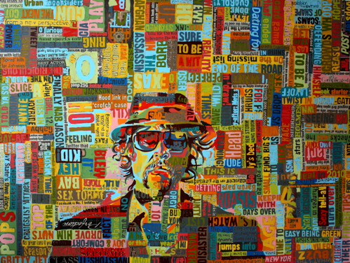
|